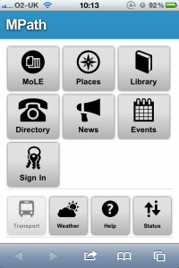
Recently there’s been a lot of noise made about mobile applications for universities and colleges. Apparently what students want to see is a dedicated app for their institution, providing them with bits and pieces of information on just about everything. There are plenty of examples, a quick search of the iTunes App Store reveals several universities which are keen for you to download their slice of application goodness. Entire products have sprung up to address this market, and some places have even gone all out and written their own.
All this is good. After all, who wouldn’t want to be able to check things like their timetable, their library fees and the state of the university’s IT services from their phone? What could be cooler than tapping a button and being told where your nearest free PC or copy of a book is? We like the concept so we’re having a look at mobile stuff, especially given that according to our analytics an appreciable fraction of our users are now trying to access services from their mobile.
However, we’re not entirely convinced about the route of apps. Sure they let you hook straight into things like geolocation and local storage, but with HTML5 so can a website. Apps also need to be made for the whole range of devices out there. iOS and Android are the big players, but you’re then cutting out Blackberry, Windows Phone 7, WebOS and Symbian devices. Apps also have an approval process to go through, or if not then they have a slightly complex installation route. There’s also a requirement either to pay someone a lot of money to make an app, or to spend a lot of money on in-house development.
All this means that we’re steering away from apps as much as possible, but we still want to make sure we provide kick-ass mobile services. “How?” I hear you cry. The answer is amazingly simple – we’re going back to mobile-optimised websites.

“Oh no!” I hear you cry again. “Mobile websites are the tool of the devil! They use user agent detection and have bad redirects!”. Well, we’ve solved that as well. As much as possible we’re not building dedicated mobile-only sites, we’re just doing our job properly and making use of some awesome CSS to provide a nicely formatted visual experience across different devices and some exciting JavaScript to progressively enhance sites where possible. It’s a write-once, run-anywhere approach not just to our ‘mobile’ site, but which we’re trying to implement across the whole range of our online services. That means that the people who are accessing any online service on a phone will get a great experience without needing to use an app. It means that we can easily and quickly provide enhancements and updates to all our users across different platforms with a single tweak.
A lot of the mobile experience is made possible by our CWD framework, which provides the HTML wrapper for our services. The CWD automatically handles the pretty CSS which is necessary for an engaging mobile experience. It also provides a lot of the JavaScript frameworks which we use to enhance your experience, for example by hooking into our on-campus geolocation system or single sign-on. By combining all of these factors we can quickly deploy rich websites which work both on a desktop system and on a mobile.
There are a few other benefits to this as well. Adopting this bottom-up approach to content and then strapping style and extra functionality on top has meant that our web applications are by their very nature more accessible, more compliant and compatible with a wider range of devices. Not only are our sites rendered in their full glossy, rounded-corners, drop-shadowed glory on modern smartphones and browsers but they’re also a close approximation in older browsers. As we head backwards to older phones which may have a problem understanding CSS our sites continue to work at a basic level, since all of our HTML is semantically valid and we only provide non-essential functionality using JavaScript.
At the moment we’re in the process of nailing down our frameworks and standards, but over the next year you should start to see a lot more of our sites working perfectly on mobiles, regardless of if you’re on an iPhone, Android, Windows Phone 7, Symbian, WebOS or anything else.
And yes, it’ll still know where your nearest available computer is.
Comments are closed.