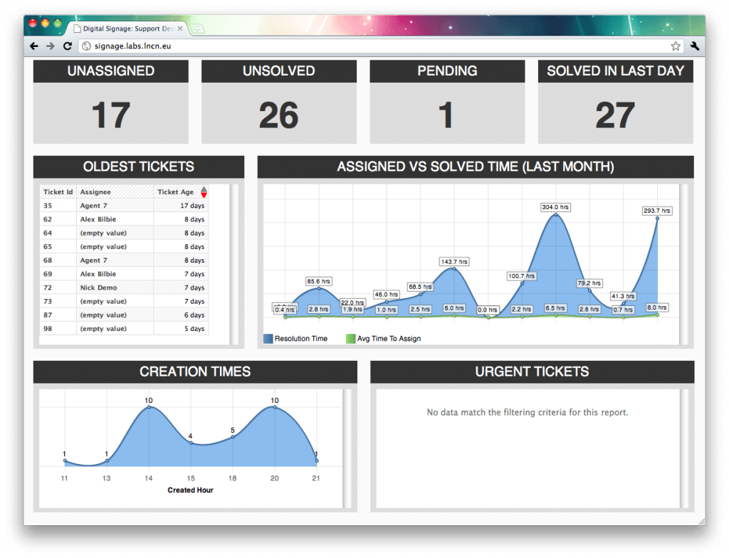
As you will know if you’ve been kicking aroud ICT for any length of time we’re moving to a brand new helpdesk software provider, the delightful people at Zendesk. Aside from the massive list of benefits we get from this (you’ll see loads about it when we launch at Christmas) we can also now tap directly into our helpdesk’s statistics to generate useful information in real-time. Going one better than this, we (finally) have the ability to put useful information on a giant display in the helpdesk, letting them know a few useful numbers and pretty graphs.
 This is using a combination of live queue data from the Zendesk API, and graphs generated daily from the nice people at GoodData. Obviously as we get a better grip on what people want to know we can mix and match even more, graphing things like trends and response rates down to the minute.
Even better, this same framework can be used for other key information throughout ICT. I’ll be updating it to a more modular system capable of supporting things like server response data and network status graphs, paving the way for even more big screens of knowledge to give a bird’s-eye view over all our systems at once.