Useful numbers on our wall!

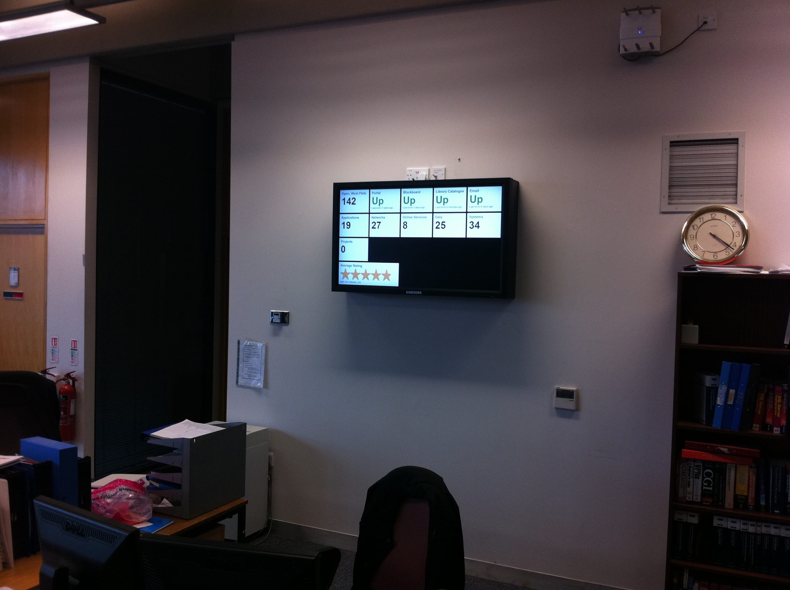
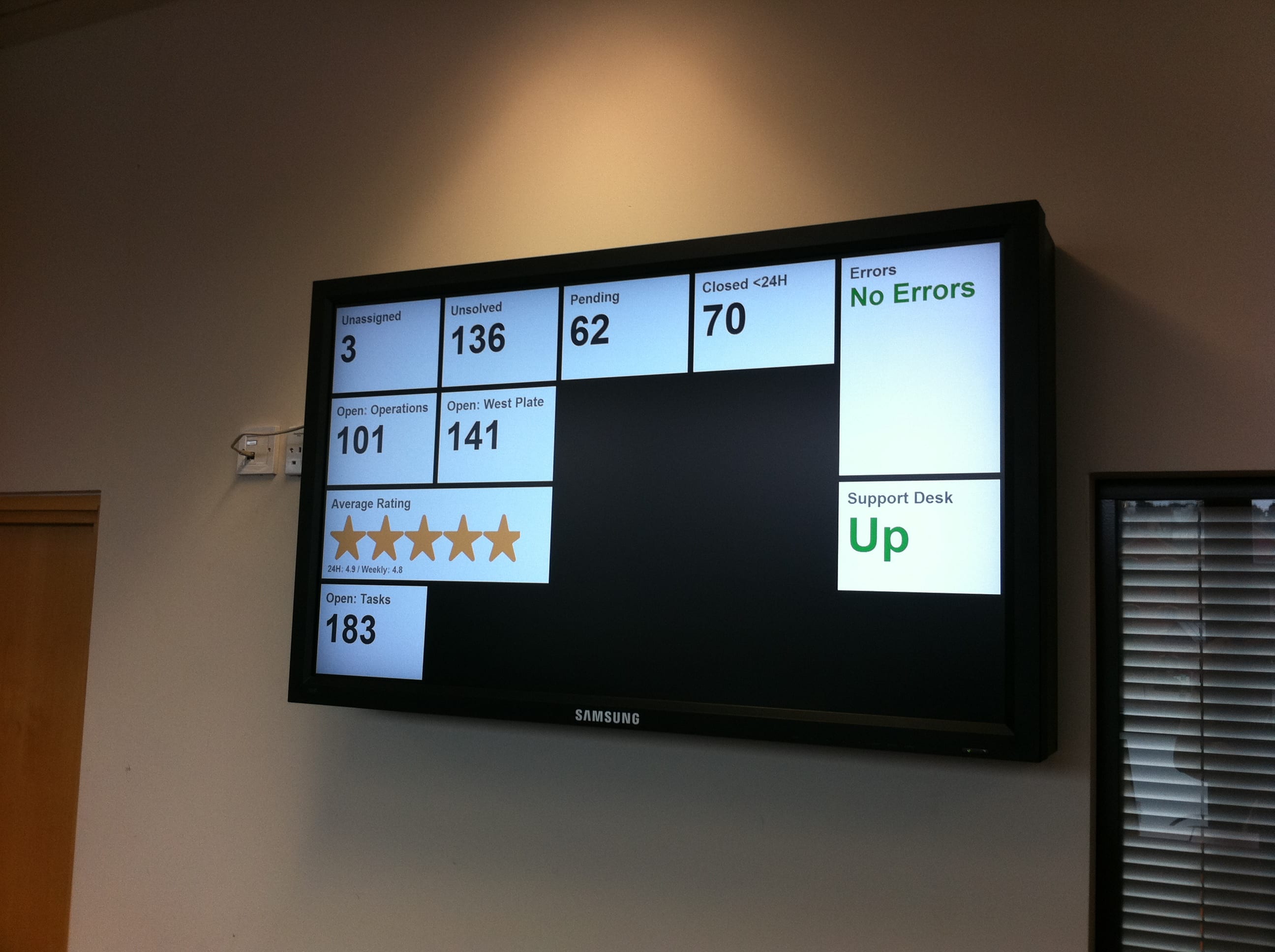
After a lengthy run-up, our Panic-inspired status boards are partially here! We have two Samsung 460MX-3 displays (one for each of our two offices), kitted out with the Network module which gives them an embedded system we can control remotely.

We’re currently viewing a custom web page – one for each office – displaying some key stats from our ticketing system. This is only a first step though, we’ll be developing the status boards to tell people what they need to know, be that how servers are performing, how many tickets they’ve got open or how much traffic is flowing through a given website.

And now, photos!

The Dashboards Are Coming!

Hot on the heels of my ability to extract key information from Zendesk, I’m pleased to announce that we now have two new bits of data available for people to digest. The first one is a set of numbers from our current service desk software, which will (hopefully) be appearing in the ICT service desk sometime in the next week whilst we try hammer through some old tickets.

The next, more usefully for everyone on the academic side, is a summary display of PC availability in the GCW. There’s a bit of worry that the numbers may not be 100% accurate, but we’ve got a hardware audit planned so hopefully by the 24/5 opening these stats will be shockingly accurate, and possibly arranged into zones so you can find a free seat even easier.

Enjoy!

A Dashboard of Joy

As you will know if you’ve been kicking aroud ICT for any length of time we’re moving to a brand new helpdesk software provider, the delightful people at Zendesk. Aside from the massive list of benefits we get from this (you’ll see loads about it when we launch at Christmas) we can also now tap directly into our helpdesk’s statistics to generate useful information in real-time. Going one better than this, we (finally) have the ability to put useful information on a giant display in the helpdesk, letting them know a few useful numbers and pretty graphs.

This is using a combination of live queue data from the Zendesk API, and graphs generated daily from the nice people at GoodData. Obviously as we get a better grip on what people want to know we can mix and match even more, graphing things like trends and response rates down to the minute.

Even better, this same framework can be used for other key information throughout ICT. I’ll be updating it to a more modular system capable of supporting things like server response data and network status graphs, paving the way for even more big screens of knowledge to give a bird’s-eye view over all our systems at once.