Searching The University

Part of my remit as one of the Online Service Team’s tame students is to take time now and then to step back, look at things, and work out how they could be made all-around better. An example of this has been the slow but steady march towards a common, uniform, standards-compliant styling for every web service.

All my rambling aside, I spotted a brilliant post from the BBC Internet Blog on searching the BBC. In short, their new Search+ trawls the entire BBC looking for what you’re after, and then decides what’s most relevant within context. Data representation and organisation is a big area of interest for me (the Cybernetics part of my degree has a huge focus on knowledge representation), and searching is an area in which the University, to put it bluntly, sucks.

Bits and pieces work on their own, for example the Library Catalogue searches the library fairly well, and the Phone Search tends to find who you’re looking for. Blogs has a search, although it does skim over a few things. There’s also Portal, which has a search function which alternates between sometimes giving you something relevant and sometimes picking random, outdated and irrelevant content from 5 years ago.

What’s needed is something a bit like the Awesome Bar in Firefox, simultaneously looking at a myriad of sources to find something relevant and presenting it to the user. In short, a single box in which you could type “Portal” and find the Portal, or “Nick Jackson” and find my directory entry, or “Somerville” and find his book on software engineering, or “help” and be taken to our support pages. Something which simultaneously scrubs across any data source we care to let it at, returning data as fast as possible.

Thoughts? Opinions? Do you want a single ‘search the University’ box with options to narrow your search, or would you prefer to have to start by specifying what you’re after?
Designing for Everything

As promised not long ago (earlier today, in fact) more work has been done on the Common Web Design to make it a bit shiner and a bit more ready for prime time. In all honesty, Alex did a lot of the work to actually make the design fit together, and now the challenge is how to make it friendlier for things like large text browsers. I suspect there will be much mucking around replacing pixel values with em values.

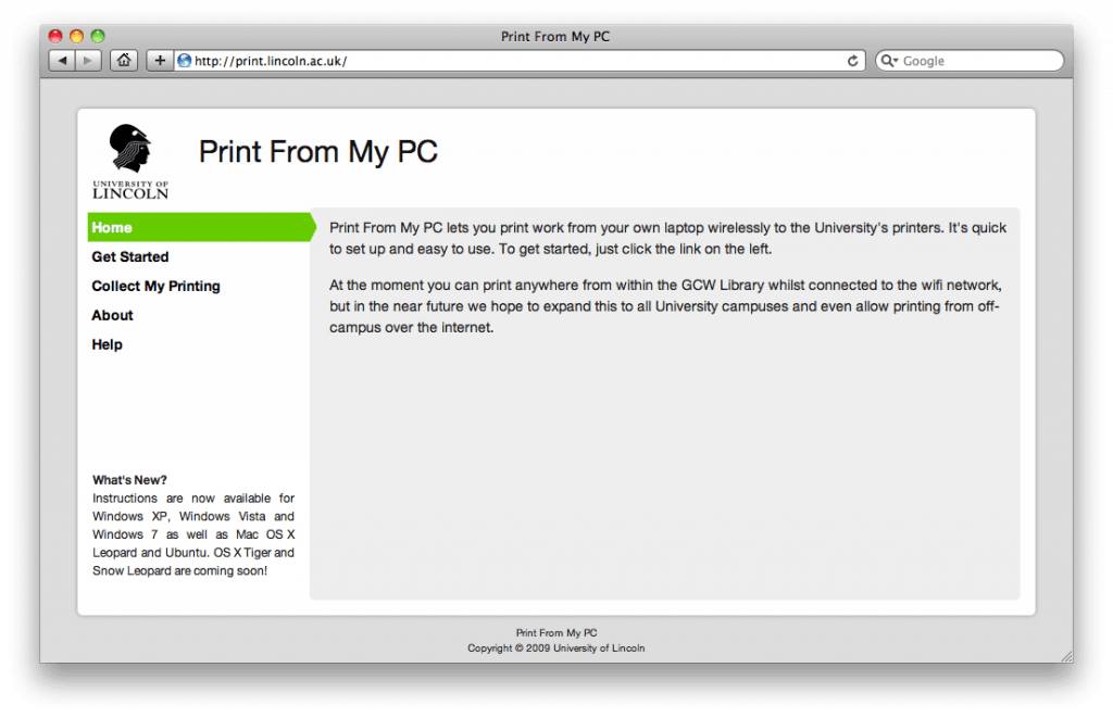
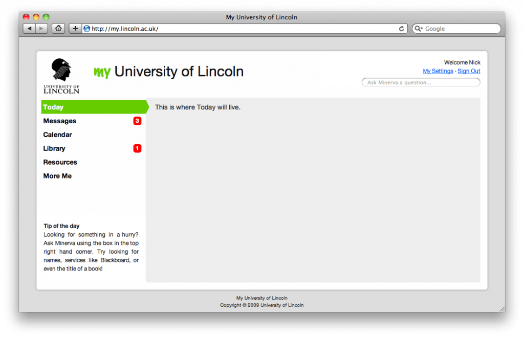
Anyway, regardless of what needs to be done I thought I should share with you some of what has been done – specifically mockups of a shinier Print From My PC support website, and the beginnings of my.lincoln. I’d like to point out that these designs aren’t put together in Photoshop, they are genuine renders by the browser, in this case Safari. They also work in Internet Explorer as far back as IE6, Firefox, Opera, Chrome and even Lynx (people using screen readers will love us).

Mockup of Print From My PC using CWD.
Mockup of my.lincoln using CWD.

Shiny, huh? A nice side-effect of this design – and one which was planned to be doable from the beginning – is that they are easily tweakable to be touchscreen friendly with big, chunky menu buttons and fixed height presentation. I’ll leave it to your imagination as to what we could do with touchscreens and a nice web interface to University services, because we don’t have any plans (or even solid ideas) at this end.

When The Email Goes Dark…

Update regarding the state of emails: I’ve not heard official words from IT on the state of play of the email server, however my account (which was out yesterday) is now back in action. I’m guessing this is a good thing.

Today, along with 1/3 of the other staff and students at Lincoln, I’ve been devoid of emails. This is down to a problem with one of the three email stores at the University, and includes staff accounts beginning with letters A, B, M-O and V-Z along with a third of student accounts (pretty much at random). People are working on fixing it. You can keep up to date with it on Get Satisfaction.

Oddly enough this has let me spend a couple of hours working on stuff without being distracted by people asking silly questions. Instead I’ve been looking at the user interface tweaks necessary to encompass some changes to the student halls network access controller, and thinking more about the dream of a common design and components for web services.

Put simply myself (along with my partner in crime, Alex) have been throwing ideas backwards and forwards for a couple of weeks now on the subject of a single coherent way into all of Lincoln’s web services, inventively dubbed my.lincoln. The idea is of a single website which collects and collates everything you might need to know from the myriad of services as well as letting you fine-tune how they work for you.

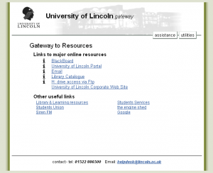
The current 'gateway' style used by Online Services.
The current ‘gateway’ style used by Online Services.

As a part of this (once I’d beaten another kink out of how Vista behaves with PFMPC ((Print From My PC))) I began mucking around with some CSS, aiming to throw together a layout based on something Alex mocked up. The old ‘gateway’ style in use in several places is actually quite messy behind the scenes, is extraordinarily narrow, and doesn’t provide much flexibility. You can put buttons at the top, and then a load of text.

There is also a ‘new gateway’ style which I knocked out for PFMPC which fundamentally looks the same (or at least very similar) but which is completely standards compliant with the exception of some little bits of CSS. However, this still has the problems of being narrow, a bit dull, and lacking in anything which makes you go “wow, this is a great, well designed web service”.

Which is why Alex and myself decided a change was needed. Something wider, faster, cleaner, smarter, more flexible, more appealing, ready for Web 2.0, ready for single-sign-on, accessible, standards-compliant and ready for use in every browser we could think of (including Lynx, and even including IE6). We’ve nicknamed it the “Common Web Design” in the vague hopes that the name will explain what it should be used for and people can latch on to the idea.

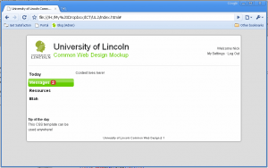
The very first version of the CWD.

Along with this will come a set of guidelines on how to write content for the CWD so that everything clicks together nicely. The whole thing is specifically designed to be portable between services (perhaps using the c.lincoln.ac.uk storage location for CSS, images and JavaScript). More importantly I feel that the CWD is a deliberate disconnect from the old look and feel. Things using the design won’t be a re-hash of the old systems with the same quirks, they will be ground-up redesigns with goals of ease-of-use and interoperability explicitly in mind.

This is very much a work in progress and probably won’t ever be seen in the wild, but we can hope. Ideally I’d like to get the design finished and roll it out for PFMPC and LUNA to help spread the message that ‘things are changing’, but since I’ve mostly done this in my own time and off my own back I may surprise people.

Unifying the Look

During the saga of getting Print from My PC working, I had to build some pages to help people set the whole thing up. Predictably, this included clobbering some HTML and CSS around (and for the record, I still hate ASP with a burning passion).

Online Services already has an online ‘look’ which is visible on the Gateway, which seems to be used wherever possible. The trouble is, the entire layout and design is based on some very old HTML and CSS (and an inexplicable reliance on JavaScript, which I’ll ignore for now). Each individual subset of the online services provided by the University has a subtly different stylesheet and a different way of doing things, so for Print for My PC I decided to mostly scrap the existing code and start from scratch.

The result is visually almost identical, although in a few places it sports crisper lines and cleaner finishes. However, behind the scenes the CSS is smaller, faster, slicker, more standards compliant, provides better support for assistive technologies, makes greater use of flexible positioning and so on. There’s a ‘standard’ stylesheet to provide the unified look, and then an individual ‘tweaks’ stylesheet for some PFMPC specific colour adjustments. Finally, PFMPC makes use of some common JavaScript scripts to handle the nice lightbox effect for popup images.

Why am I blogging about this? Well, firstly this is a blog which in part aims to let you look behind the scenes at what’s happening. Secondly and most importantly, however, the code is specifically designed to be incredibly portable between various services. I envision there being yet another subdomain (sorry!) such as common.lincoln.ac.uk, which exists purely to store objects shared by all services. The stylesheets, the images, the scripts. The result once properly implemented would be ultimately beneficial – it would improve caching, reducing hits to services. It would enforce consistent appearance. Applying a code or styling fix would need to be done once and would be replicated to all services using it. Finally and most importantly, it would get people into the mindset of “data should only exist once” which is a key part of the Web 2.0 way.

Still, mindless code changes for such a minor improvement would be senseless. Which is why I’m going to suggest the following: create common.lincoln.ac.uk, add the resources to it, and when new services are created or services are updated make them use the common resources. It’ll be slow, but it’ll be worth it.

Wave at me!

I’m taking a short break from printing (at the moment I’m sat at home ripping apart the IPP specification and some logs from CUPS to work out why it almost but not quite works) to relay a brief message on Google Wave, and what it is.

Is it just me who thinks that this would be amazing in an academic environment, specifically with regards to planning and collaboration for projects? Hopefully when it’s out of preview and into beta it’ll join Google Apps, providing yet another reason (along with Kirsty’s work on Google Docs) for the University to make Apps available for us all. We’ll get rid of that infernal Outlook Web Access and bizzarely low inbox quota yet!

More on iCal

It has been brought to my attention that I need to point out some extra information regarding my post about iCal timetables, specifically this bit:

Which is why I’m happy to announce that a Level 2 Computing student has undertaken the monumentally complex task of taking your University timetable and turning it into an iCal format. The monumentally complex task which people assured me was technically very difficult due to the way timetabling was organised.

As Tim has rightly pointed out, the “monumentally complex task” of extracting the data has already been done in order to view your timetables at all, given that the data comes out of the timetabling system in somewhat of a mess.

So, kudos to Alex for hacking the data into iCal format, but equally kudos to those who managed to get it into HTML in the first place.

In future though, I would like to see more data being available in the open format (JSON, XML, REST and those other data exchange acronyms… just preferably not SOAP) and then being re-interpreted according to how it’s meant to be viewed. Ideally the data should flow from timetabling to the data repository, and then be extracted and reformatted into the HTML view. One definitive, authoritative source for the data.

Why Sharing Data is a Good Thing™

One of the things I’m very big on is open data. Not necessarily just broadcasting everything to the universe for all to see (which would be stupid), but instead offering data in a format which is machine readable by design, and which can be easily taken, manipulated, shared, mashed and displayed as the user wants to see it and not as the company decides it should be consumed (although providing a ‘default’ view for users not savvy with open data is acceptable and indeed encouraged).

Which is why I’m happy to announce that a Level 2 Computing student has undertaken the monumentally complex task of taking your University timetable and turning it into an iCal format. The monumentally complex task which people assured me was technically very difficult due to the way timetabling was organised. The nigh on impossible challenge of extracting data and presenting it in a new format. The arduous task which took Alex an hour of tinkering in PHP, without so much as access to the raw data.

If you’re interested in getting your timetable in a format you can use on many devices, head off to Friendly Student Timetables (beta) at Learning Lab. Source code available.

Web 2.0 and the University

Whilst running around the Internet dredging up case studies for how companies have used Get Satisfaction, I stumbled upon this presentation by one of the founders on how businesses need to change and adapt to the post-Web-2.0 world. It makes some excellent points about how you need to get used to losing control to some extent, a fact which I’m eager to see the University embrace.

I may have to highlight some of these points when I start drawing up reports. In the meantime, feel free to let me know your opinions on how the University is doing with regards to the whole Web 2.0 revolution. Feedback is always useful.