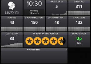
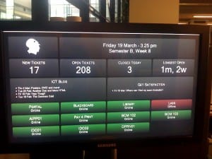
In the past few weeks I’ve been dabbling (in between my ‘real’ projects of Jerome and Linking You) with the concept of ‘dashboard’ displays and information radiators. For those of you unfamiliar with the concept they are fundamentally a place which presents information in an easy to digest format. Some are pinboards, some are whiteboards, some are clothes lines with bits of paper pegged to them and some are displays or projectors.
What I’ve opted for is the display method, in no small way inspired by the guys at Panic. However, since between ICT we have what is generally referred to as a metric shedload of information that we want to get hold of I decided that instead of crafting a display for each individual group’s specific needs I would instead come up with a sexy looking framework for rapidly building dashboards. These are designed to live on large screens dotted around the office, visible all day to anybody who happens to look at them.
 There’s already an example in use at the Service Desk, where a trusty old iMac is proudly displaying various stats from Zendesk (our ticket manager) to the support team. Initial feedback is that people really like being able to get an overview of what’s going on in one place, as well as any urgent jobs and their feedback averages.
Down in the depths of OST, on the other hand, we’re not massively bothered about our ticket stats in such an immediate manner. Instead we’re far more interested in things like our server availability, response time and load. This means that the modules on our dashboard currently pull data from our Nagios monitoring tool, informing us with the red alert klaxon from Star Trek if things go horribly wrong (causing much turning of heads towards the board to see what’s happened, and everyone else in ICT looking at us in confusion).
Hopefully as time goes on more people will find data which can be represented using these boards, meaning that they will start popping up in more places and exposing data which lets us make faster, smarter decisions about what we’re doing. I’ve already started working on a dashboard for getting the data from the agile development tracker that Alex and I use into a really easily digested format, and I’ll be talking to the Projects team to find out exactly what they want to see with regards to more overarching project management.
Easier? I think so.
 Now you can, as I’ve just added another three of our core services (Portal, Email and Library Catalogue) and one non-core but useful service (Blogs) to our Pingdom monitoring system. They now join Blackboard on a brand new public status page. Even better, because we like being open with things like this, you can see the history of our monitoring as far back as it goes. For the new ones this means you can look over history back to today, but for Blackboard this goes all the way back to February.
