Induction With Added Awesome

The University of Lincoln is currently doing really well in terms of improving its standing in the NSS, which measures student satisfaction. It’s doing this by focussing a fair bit (although not as much as I’d like) of its energies on the student experience.

At the beginning of this year I spent induction week mostly watching what was going on, how students behaved, and what went wrong. I came up with a report on induction problems which spanned 4 sides of A4, detailing everything from confusion over what a student’s email address was through to the fact that people were told to fully update their laptop before they came to university by a flyer on their bed when they arrived (oops). However, this blog post isn’t about trying to fix those problems or assign blame to any one group (if that’s even possible). Instead it’s about trying to change how we handle bits of induction so that those problems simply don’t exist. Let’s get going.

Make Awesome Induction Material

Ring binders are long-lasting, compact and awesome.

One cause of a lot of problems was the sheer volume and variety of printed material that students were given in their induction manual, nicely wrapped up in a folder which had “This folder is full of important information. Don’t say we didn’t tell you!” printed on a bit of paper visible through the side. Quite apart from being condescending to the new students (I overheard more than one student commenting on “being treated like children”) the effect was akin to picking up a Sunday newspaper and watching 14 different supplements fall out. Students were given a University handbook, a copy of the University regulations, an SU handbook, the IT Handy Guide, a bit about the Library, a bit of paper telling them where to find their induction timetable, a schedule of SU events, a map of the campus, and probably a free pen as well. All useful, but ultimately disorganised and hard to find what you’re looking for.

Here’s what I propose. Every student should be given an A5 polypropylene ring binder printed with the University logo. The contents of this folder would be much the same as the current induction material, just collated, formatted, edited, typeset and properly published and printed on reasonable weight paper by a central body. This does have the slightly unwanted side effect of imposing a deadline by which to get induction material produced, but it’s necessary if the University wants to provide a solid experience. This material is neatly split into sections using properly printed tabs (also on polypropylene for added toughness, and because it will look great) so that a student can find what they’re looking for easily. This is where it gets awesome.

Ring binders can have extra information added to them very easily. This means that each student’s folder can have a section titled ‘My Course’, which will have material directly relevant to them such as induction timetables! Similarly we can add material to deal with ‘exception’ students such as mature or international, and – the pièce de résistance – a personalised page with their ID number, email address, name and contact details of their subject librarian and course co-ordinator and so on. Signing in is easier, getting in touch with course specific support is easier. Everyone wins, except for the people who expected to be able to add their material to the enrolment pack the weekend before students arrived.

Continue reading “Induction With Added Awesome”

Why We Don’t Do IE6

One thing we frequently wrestle with in Online Services is browser compatibility, and making sure that our latest and most awesome web apps (just wait until you see Total ReCal) behave properly. Predictably, as web developers, we face a daily battle to make things work in Internet Explorer when it decides that “14 pixels” actually means “8 pixels, in blue, flashing and dancing the bolero”.

In the past we’ve been told to make things work in Internet Explorer to the extent that compatibility with other browsers has been an optional extra. I still find corporate websites which break in Firefox (with it’s Gecko renderer) and the WebKit-toting Safari and Chrome, but with the recent addition of awesome analytics tools to most of our key web services we can now prove that ‘alternative’ browsers are actually the mainstream. In fact, Internet Explorer only makes up 56% of visitors to University sites and once we remove the bias of corporate desktop machines it drops to 43%. Internet Explorer is no longer the sole target of our HTML and CSS massaging affections.

However, we’re still tasked with supporting Internet Explorer 6 and 7 because apparently these old versions (IE6 is actually a decade since release) are still absolutely perfect in the eyes of certain bits of Her Majesty’s Government, and certain suppliers of software the University uses. This is a complete falsehood, and using IE6 to browse the modern internet is roughly equivalent to navigating down the Colorado River in a shoe. It’s slow, lacks support for modern standards, is monumentally insecure and costs absolutely nothing to update to a newer version.

What we’re doing now is taking a step forwards along with a few other small names such as Google, Facebook, Yahoo!, Microsoft and others in saying that IE6 support is no longer an option, and any new services we create or services which we update will no longer have support for IE6. They may work, but it’s not through design. If you’re still using IE6, for the love of all things upgrade. If you can’t upgrade because you’re using a corporate system, write a daily email to your IT team demanding they either update or install an alternative browser.

Who are you?

Today I’ve mostly been working on the magic of our user data collector for Nucleus, an awesome bit of technology which takes our slightly slow existing method of finding user information and replacing it with one blisteringly fast one based on our ever-favourite database Mongo.

What it does is – on a regular schedule – go through the entire directory letter by letter, collect all the users, and write their details to the database. How it does this, however, is a bit smarter than a bulk import in that it actually looks to see if the user has been updated or not, and records the changes. We can then use this data to do ‘push’ updates of user information – telling services which rely on user data that something has changed as soon as we can, rather than waiting for those services to have to look for changes themselves. We can also let those services do a ‘changes pull’, asking only for those records which have changed since a particular time. All of this combines to reduce network overhead and speed up processing by only sending changed details around, rather than a massive dump of all our data.

Coming soon to Nucleus will also be the first bit of cross-service collation as we begin to include data from students such as addresses and home email addresses. Where in the past this would require querying four different services, receiving a mix of data types and needing a lot of massaging to do anything useful we’ve done the hard bit for you. Even better, instead of giving insecure access to the data by providing direct database access, or blindly dumping the information, access will be controlled using the power of OAuth, giving us fine-grained control over exactly who can see what.

Build a Better Bookmark

Here’s a really quick one.

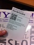
Now we’ve got awesome self service machines in the Library which can print decent receipts, why not rearrange receipts to be a bit more useful? Presenting Receipt v2, which doubles as an awesome bookmark (if you just take out one book… not quite figured out two or more), shows you the due date at the top (so it’s sticking out) and includes a QR code for quickly grabbing more details or renewing.

This is standard 80mm receipt paper (although it would easily move to 70mm if that’s what the machines use) and QR codes are easily readable by all modern mobiles at that kind of scale. Should probably include a web link as well using the magic of Linking You.

Let There Be Data

At the moment, Lincoln is standing on the edge of a huge change in the way things are done, at least as far as data is concerned. It’s been slowly pushed there by a small band of people (myself amongst them) who believe that one of the keys to making the world a better place is simply opening up data. Today it’s become clear to me that the availability of this data isn’t something that’s just wanted by an academic elite who want it ‘because it should be there’, but it’s something that’s wanted by people who just want to make things better.

Within hours of the University posting up a warning about severe weather, a Tweet dropped into my @mentions box from someone asking if there was the raw data for the warnings available. There’s already a student who’s wanting the not-yet-complete Total ReCal public timetable data for his own 3rd year project. Someone else was wanting to get hold of the GCW PC availability data. The list is endless.

So, what I’m going to try to do in some of my not-really-free time is to start the ball rolling for a website in the style of various other places around the world. Things like data.gov, data.gov.uk and data.open.ac.uk. I think data.lincoln.ac.uk should be fairly easy to rustle up. We could even use WordPress, and the whole thing is ready to go in under a day.

Who’s with me?

Cry Havoc and Let Loose the APIs of War

Those of you keeping up will know that my time at the moment is being mostly sliced up between Total ReCal, Nucleus, Jerome and Zendesk. Between them these four projects represent a monumental change in the way that a lot of things are done – that change is their reliance on APIs to achieve just about anything useful.

Today I’m going to focus on Zendesk’s integration with a few things, starting with hookups to a couple of new services we’re building to handle asset management and room information.

QR Code leading back to this site

Very simply, each asset which currently has a barcode on it will instead gain a QR Code containing a URL unique to the asset. This URL leads directly to a web based asset management system which a) gives us a way of updating assets stupidly quickly, and b) lets people report problems in three steps: scan the code, describe the problem, click ‘report’. The issue will be slotted straight into Zendesk over the API, with user details seamlessly completed from our Single Sign On service, and the asset number already completed.

On the other side, whenever someone opens a ticket on Zendesk with an asset number associated with it a cool bit of custom code will leap in and grab the asset details from our database so we can instantly see not only the details of the problem but also everything we know about the asset in question.

Rooms will similarly be gaining a QR Code which leads to the room’s entry on Nucleus Locations, from where people can view the room’s timetable, book a slot and tap a single button to tell us about anything which has gone wrong. A totally seamless experience for the end user, but which backs off to our full-blown helpdesk solution so we can track, manage and solve issues.

Continue reading “Cry Havoc and Let Loose the APIs of War”

The Dashboards Are Coming!

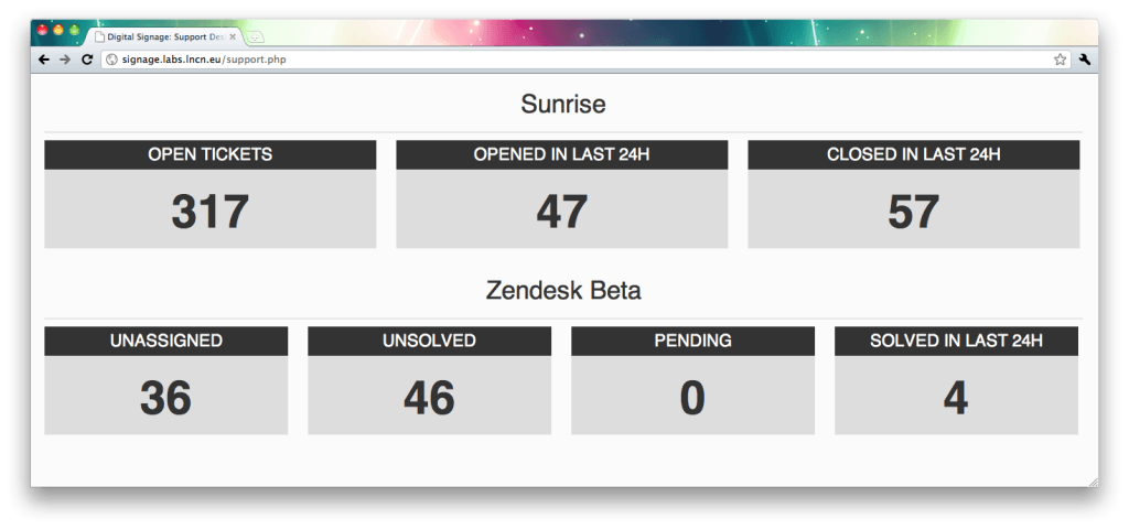
Hot on the heels of my ability to extract key information from Zendesk, I’m pleased to announce that we now have two new bits of data available for people to digest. The first one is a set of numbers from our current service desk software, which will (hopefully) be appearing in the ICT service desk sometime in the next week whilst we try hammer through some old tickets.

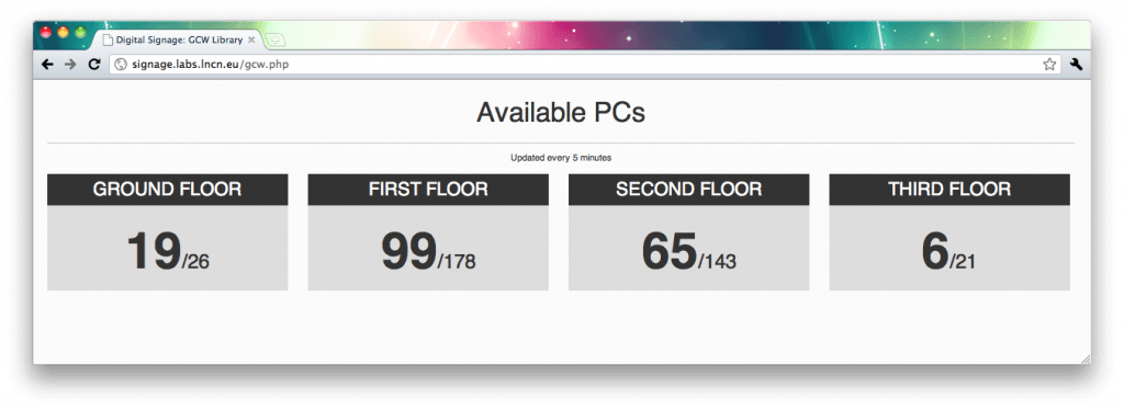
The next, more usefully for everyone on the academic side, is a summary display of PC availability in the GCW. There’s a bit of worry that the numbers may not be 100% accurate, but we’ve got a hardware audit planned so hopefully by the 24/5 opening these stats will be shockingly accurate, and possibly arranged into zones so you can find a free seat even easier.

Enjoy!

A Dashboard of Joy

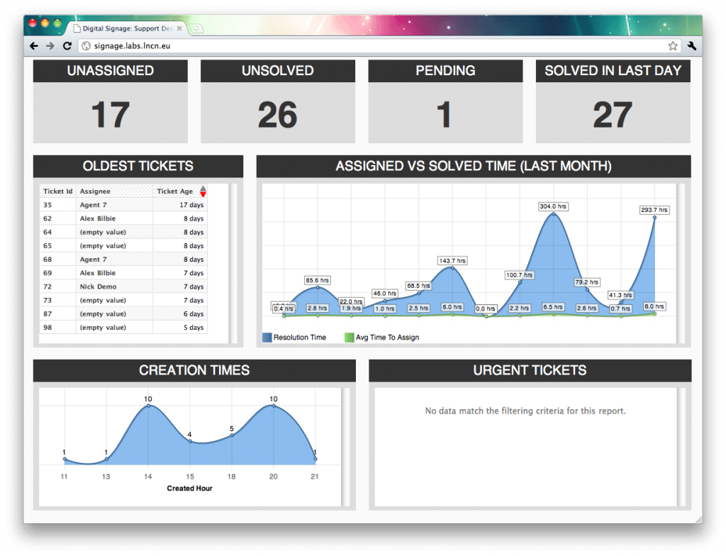
As you will know if you’ve been kicking aroud ICT for any length of time we’re moving to a brand new helpdesk software provider, the delightful people at Zendesk. Aside from the massive list of benefits we get from this (you’ll see loads about it when we launch at Christmas) we can also now tap directly into our helpdesk’s statistics to generate useful information in real-time. Going one better than this, we (finally) have the ability to put useful information on a giant display in the helpdesk, letting them know a few useful numbers and pretty graphs.

This is using a combination of live queue data from the Zendesk API, and graphs generated daily from the nice people at GoodData. Obviously as we get a better grip on what people want to know we can mix and match even more, graphing things like trends and response rates down to the minute.

Even better, this same framework can be used for other key information throughout ICT. I’ll be updating it to a more modular system capable of supporting things like server response data and network status graphs, paving the way for even more big screens of knowledge to give a bird’s-eye view over all our systems at once.

On the matter of uptime and performance…

Recently as we’ve been looking at some stats (for the first time ever) it turns out that people are actually walloping the bejesus out of a few of our systems. Things like the CWD are standing up to a huge flood of requests and although the service is working mostly as designed, it’s still not quite as perfect as we want it to be. Some requests are running a bit slow, and recently our primary server failed to come back up following a power outage (much to our annoyance).

This clearly needs to be fixed, so in preparation for CWD 2.4 – which is awesome and optimised for just about everything anyway – we’ve been looking at moving to a serious cloud based CDN. This means that aside from uptime in excess of 99.99% (just under 4 minutes and 23 seconds of downtime a month) we also gain local delivery from servers around the world, so websites load even faster no matter where you are.

It’s the little things that count.

“But it’s not our fault…”

There’s been an article recently on Bullet Online about the new self service machines in the library, and how some students find them difficult to use. This, I feel, is a fair point given that it took me a couple of minutes to get to grips with them and I’m pretty darn technology savvy.

What annoys me however is not that the Library didn’t make fixing the problem its number 1 priority (which it should – the system should have been overhauled for usability within days, not 2 months later and nothing done), but what one of the comments on the blog says. I’m not even annoyed at the contents of the comment, but what a subject librarian said when a student rep brought up the issue in a subject committee:

The subject librarin told us that the machines are state of the art and that the library has recived national regonision for this.

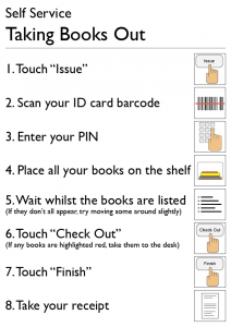
How to issue books using the self service machines.

Step back, and think about that. “It’s not a problem, these machines are state of the art”. So was the baggage handling system at Heathrow Terminal 5, and look what happened there. “It’s not our fault that your bags are lost somewhere because we didn’t test and train properly, the machine is state of the art”. That subject librarian should be hauled over the coals. It’s a problem because the student rep has told you it is, so what you need to do is acknowledge it and say what you’re going to do to fix it.

It has taken me a few minutes to put together this poster which explains (very clearly) how to take books out in 8 steps, and what to do if things go wrong. In my personal opinion this is about three steps too long, but these things can be improved on later. It is something like this which the Library should have done as soon as they realised there was a usability issue, not form a subcommittee (yes, there really is one) to discuss how they can improve usability and consider writing some help documentation.